Building clear and readable (Power BI) reports can make a big difference in project success. And, assisting Project Managers in this effort, a Project Management Office might apply Power BI to create these reports and maybe even dashboards.
On its own, Power BI is a great tool. But with the addition of custom visuals, it becomes even better.
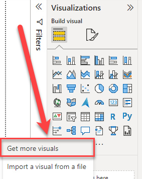
I have reviewed a large number of visuals on my YouTube Channel, always with the mindset of helping the PMO be successful with Microsoft technology. In this article I’ll discuss 5 custom visuals I believe every PMO should apply. Let’s “get more visuals”!
Chiclet slicer
Power BI Certified? Yes
Free/Payment plan? Free
This is one of the first visuals I reviewed on TPC. It’s a visual created by Microsoft as an alternative to the default filter and slicer options that the tool offers out of the box.
The reason why I like the chiclet slicer custom visual so much, is because of the way it visualizes small sets of data. You would not want to use the visual for a representation of your whole RBS or a total list of all your projects, I’m sure. But for selecting the project types, a RAG indicator or years and months the chiclet slicer is a really charming visual.
The added option to enrich a selection with an icon or image makes the visual stand out on any report.
Funnel with Source
Power BI Certified? Yes
Free/Payment plan? Free

Every project goes through a couple of phases/stages until completion. Maybe you follow a rigid PMI structure, and maybe your organization adopted a custom stage-gate model. In any situation, the visual helps the PMO to be aware of the amount of projects/costs/resource hours that are currently in Stage X/Y/Z.
The added value to have a “Source” makes this visual stand out for me. With the source, I can differentiate my funnel by actual source, but it might also (again) be interesting to select the project type. Or maybe I want to look at the Objectives that are addressed in my funnel, you know those OKR objectives? More traditionally I might be interested in portfolios or departments.
Milestone Trend Analysis Chart
Power BI Certified? Yes
Free/Payment plan? Payment plan
The Milestone Trend Analysis is a core tool for any PM and PMO. It provides a clear understanding of progress, related to milestones in the schedule.
This is the first visual on the list that has a payment plan associated to it. This means that, for it to show properly on the Power BI Service, you will need to buy a license. Because this is, to my knowledge the only Milestone Trend Analysis visual available, I would highly recommend considering the purchase (be aware, I am no affiliate to Nova Silva, this is my personal opinion).
For this visual you are required to track historical values on your schedule(s). This is needed to track the X-axis on the reporting dates. As I mention in the video, you can do this by tracking the history in Excel, SQL or advanced snapshotting options such as the Projectum Power HUB.
Gantt Chart visuals
Power BI Certified? Both
Free/Payment plan? Both
Who doesn’t love a good Gantt chart? I for one, think it is the best representation option for any schedule. Being able to read a Gantt chart should be a core competence of any PM. Therefore, it is good to know that Microsoft, and other companies have invested time in providing Gantt chart visuals in Power BI.
Because there are different approaches to visualizing a Gantt, I try my luck with every Custom visual available. Some have a heavy focus on phase visualization (Lingaro) while others are a powerhouse with very extensive options to visualize not only a single schedule, but whole programmes in as much detail as you like (MAQ and XViz).
It shouldn’t come as a surprise that some of these visuals have a payment plan attached. The level of detail and general support of users provide reason enough. And if you don’t currently have the budget for a paid version, you are in luck because there are enough free options available.
Table Sorter
Power BI Certified? Yes
Free/Payment plan? Free

This is another custom visual, created by Microsoft, just like the Chiclet Slicer and the Timeline Storyteller. There has been a lot of attention to the visual splendor of this visual. And if have a numeric value inside a table (Actual Cost At Completion, number of Risks, Total Hours Work etc.) you might be interested in this visual.
Any PMO will want to have a data-heavy representation of the portfolio, this is normally done by cramming as much data in a table as possible. It might make sense to make purpose-specific tables instead, focussing on a specific question that needs to be answered by the visual. This way you can have a table with 4 to 7 columns and a nice visual representation of the numerical values as well.
Don’t overcrowd your report page, make it purpose-driven.
Final notes on Power BI visuals for PMO’s
I think Microsoft has a really great solution with Power BI. The fact that the application is open for external improvements on visuals is a great strategy. With companies like MAQ Software Nova Silva and OKViz we are sure to see more professionally designed visuals as time goes by. Make sure to subscribe to the YouTube channel to not miss any great visual in the future.
If you enjoyed this article, you might also like to read about my 3 favorite MS Project reports. Did you know that MS Project has an internal reporting engine nowadays? In this article, I describe 3 of them.
And if you think this article helped you or your Project Management Office, I hope you will share the article to increase the number of people it can help.