Hi Readers,
In this post I would like to share my 3 favorite Microsoft Project Reports. Be aware that these are reports created using the technology that has been available since the 2013 version of Project. If you are curious about older reports have a look at this post about “updating the visual reports“.
The reports in project are all related to information within your schedule. The more you put in, the better the reports will look. Here are some key elements that you would like to have in the schedule to get great Microsoft Project reports:
- Progress
- Assignments and costs
- Baseline
At the end of this post I’ll share some links on all 3 elements. Without these basics, you don’t have anything to report on.
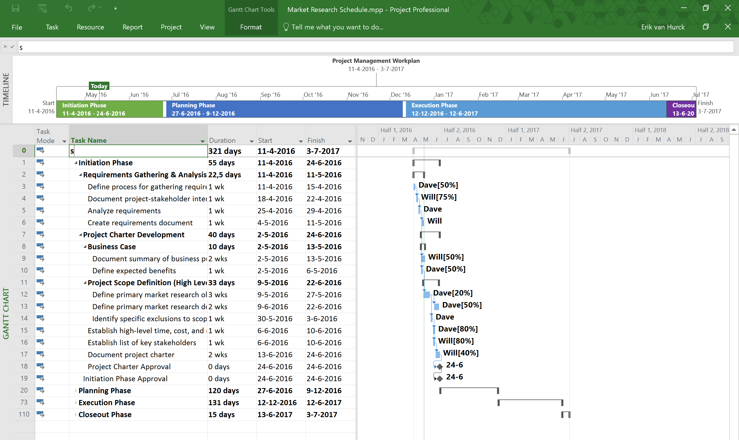
For the following screenshots I used “Market Research Schedule”. an Office template, available from the “new” section under “File”. I wrote an article about the office templates, you can find it by clicking here. I made some changes to duration and added Will and Dave as resources, both have hourly rates filled in. I added assignments, created a baseline and set progress.
Cash flow report
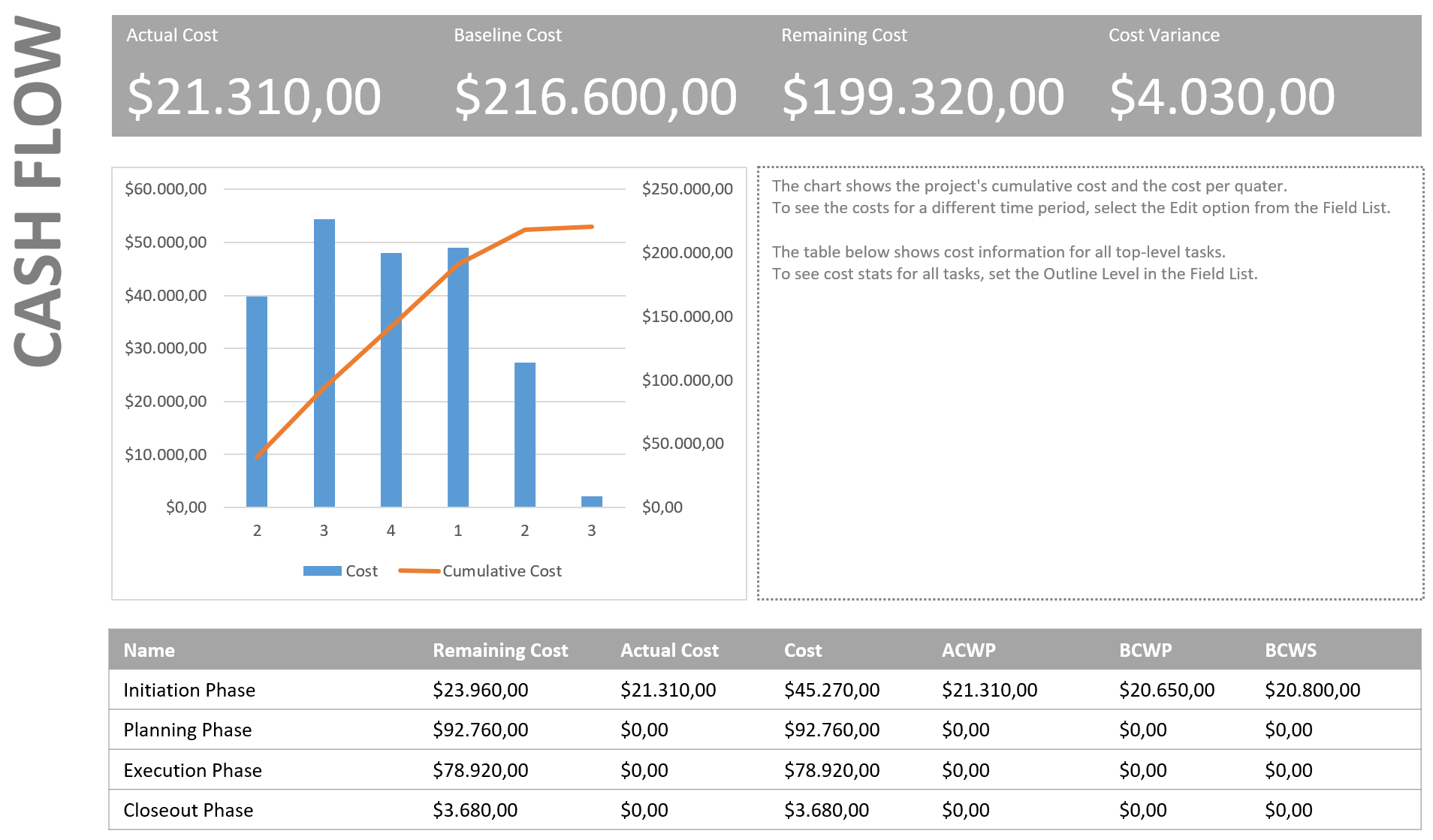
The Cash flow report is amazing, in it’s simplicity. When you create a good WBS in your schedule the table will show you everything cost related to the phases, or if you are a more PMI minded person to all the top deliverables. The table even has the EVM values.
There is room for some textual data, you just need to change the text in the right section to reflect the information you want to share with the financial stakeholders.
The chart can be changed to show weekly, monthly, quarterly values based on the size of your schedule. And you can add “actuals” to the chart as well.
The top section is just pure gold! In 1 bar it shows you the current progress on the whole schedule. Why did I have a cost variance? I changed the rate of Will from 100 dollar to 105 dollar per hour.
Critical Tasks report
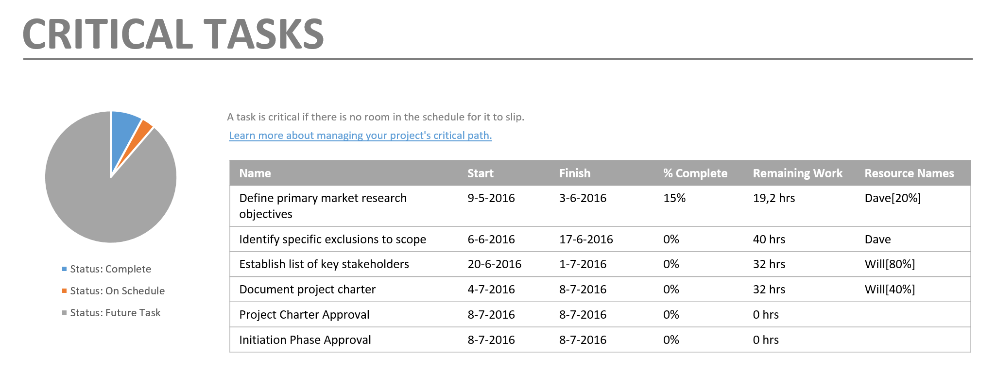
The Critical Tasks report is charming because it set’s the Critical Path out in a table form.
But there is a lot of room left to get an extra graph in or some text. Also, and I descovered this just recently, the report changes based on what level you have collapsed in the Gantt chart! Nice, the example above just shows the current phase. but when I expand all the tasks it will look more like this (and the list doesn’t end there):
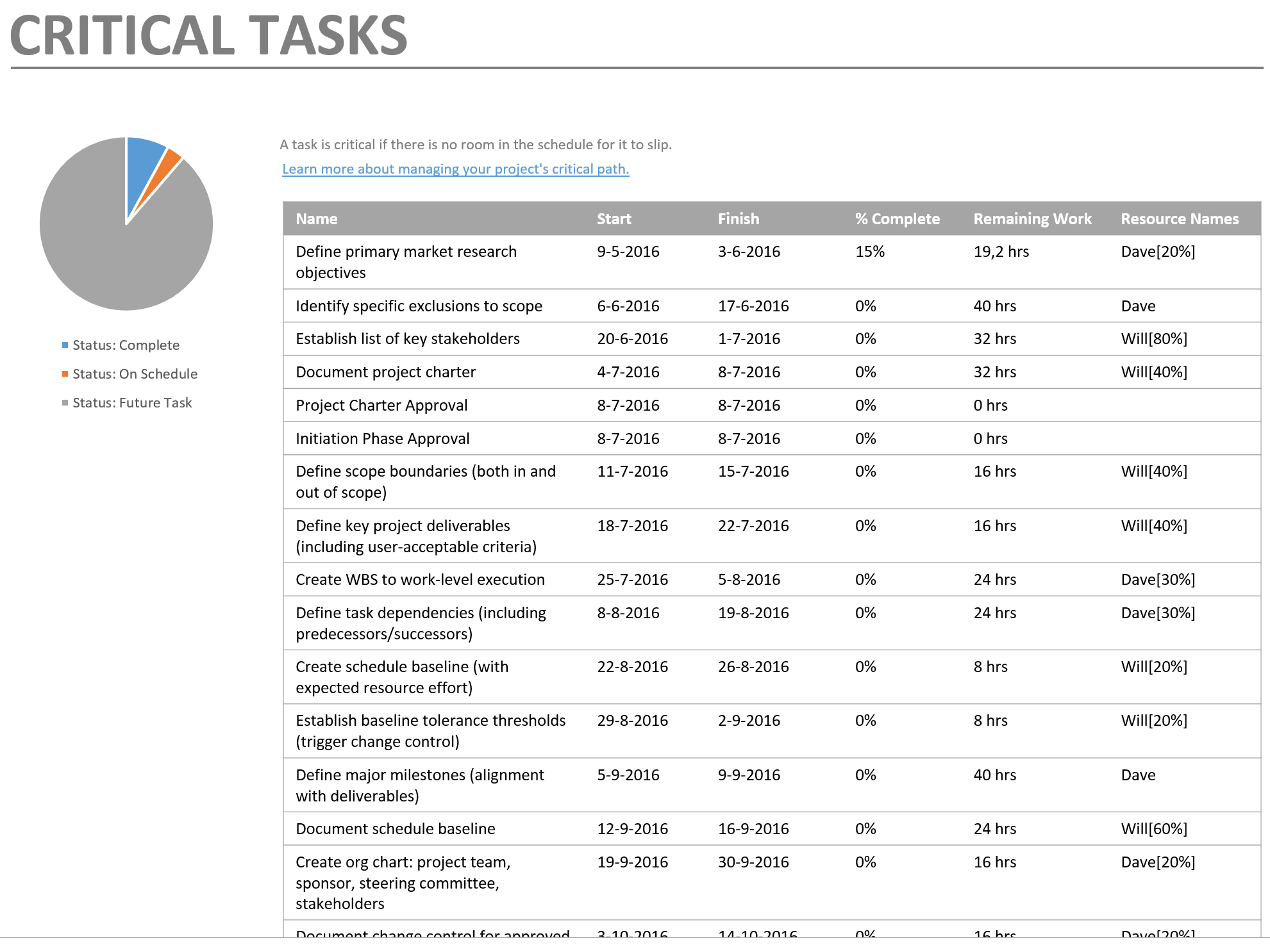
This is charming because you can filter on a time period in your Gantt chart, then move to the report and have all the information on only the critical elements. Now don’t forget the resource critical path that Eric Uyttewaal mentions in his books! That is still something that needs to be added to the product if you ask me.
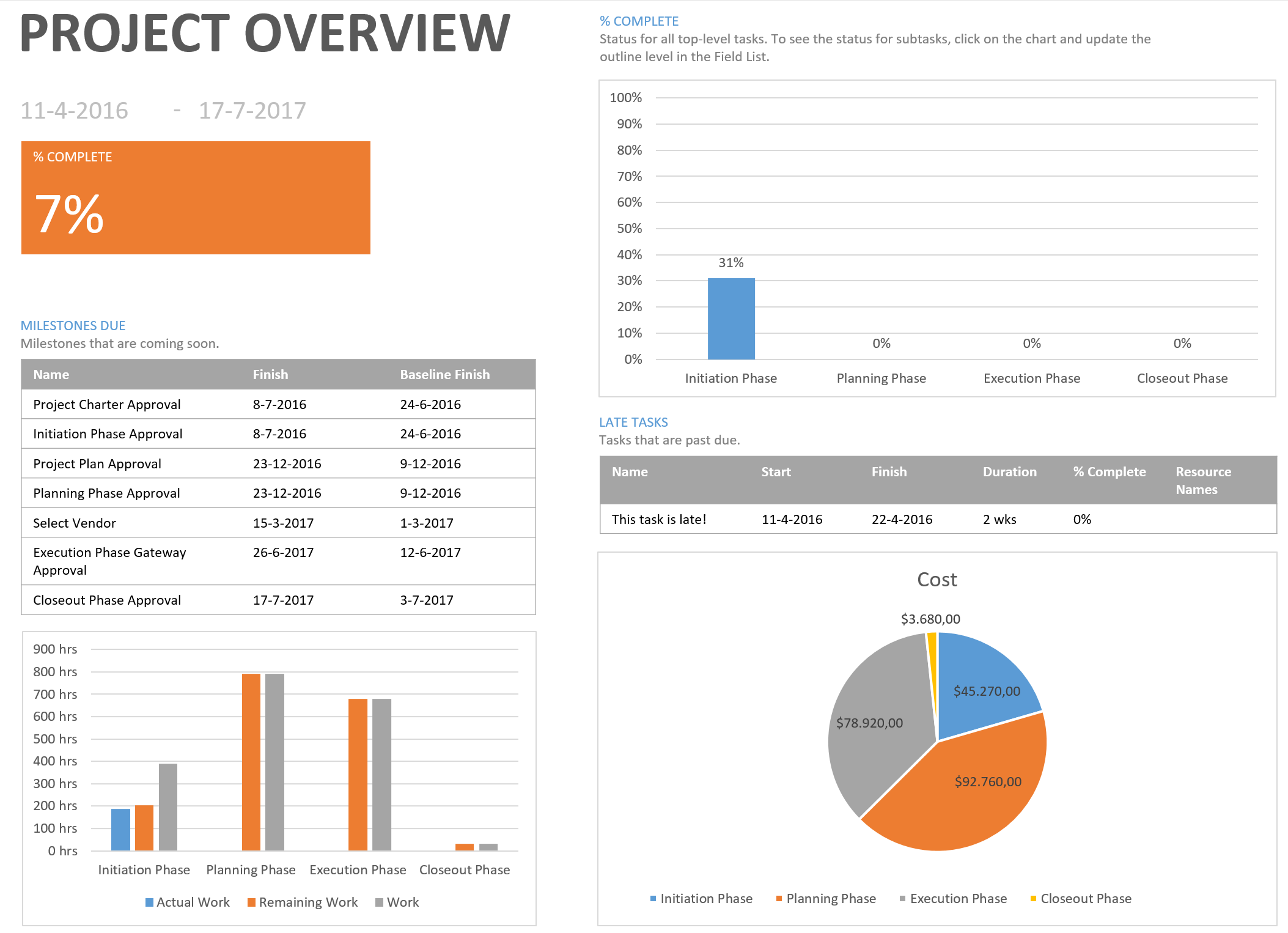
Project overview report
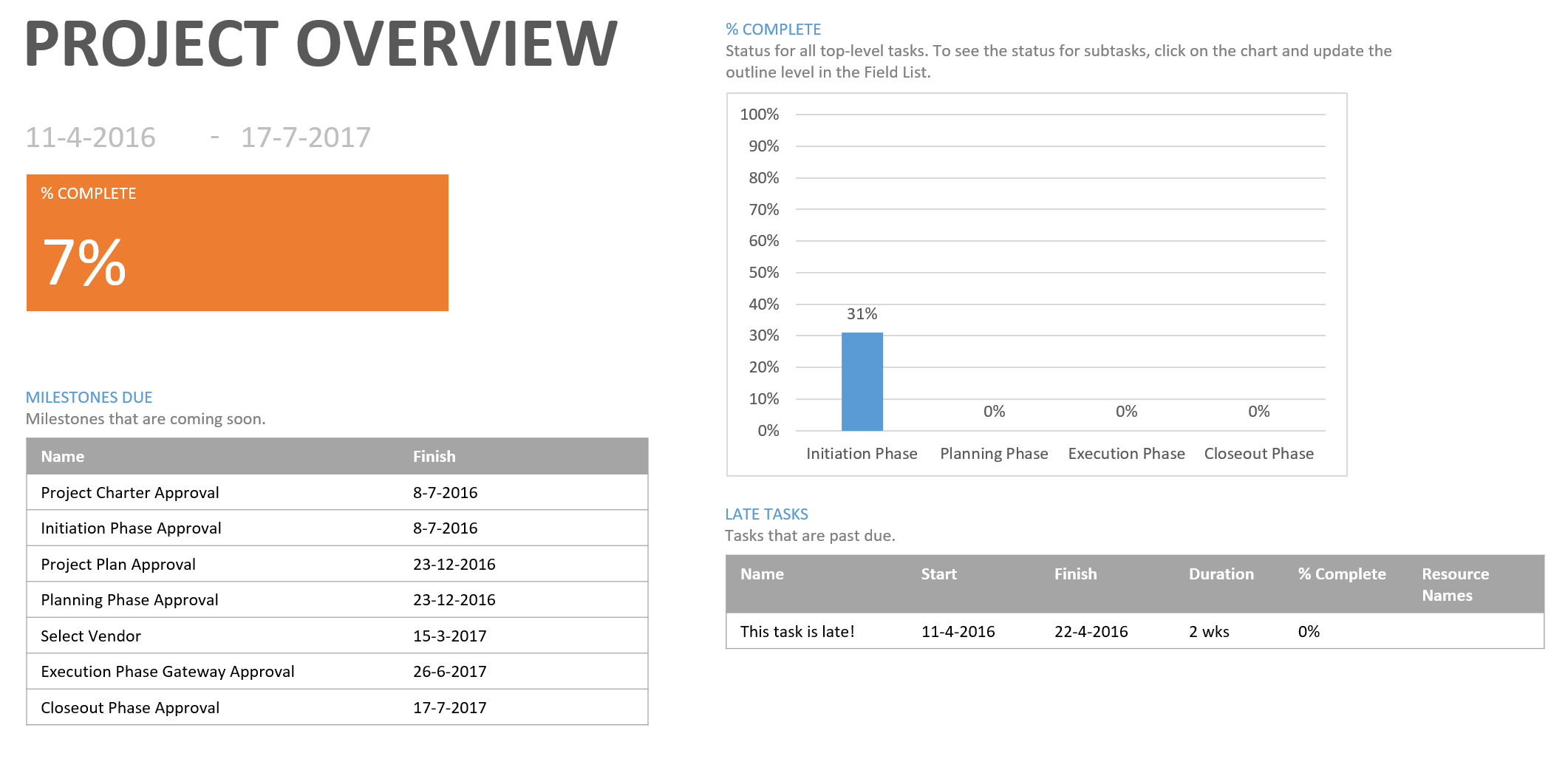
The last report I wanted to share is one that grabs all the project task information and wraps that nice an tight in a little dashboard.
Just like the other reports the trick is using the elements to your best intention, this report is focusses only on progress. But with a few quick changes it also incorporates cost and assignments. The result is a one-stop-all-you-need-too-know-dashboard:
The basics to getting great MS Project Reports
As stated in the start of the post I wanted to share some links to information to the following items:
- Progress
- Assignments and costs
- Baseline
That’s it for now, if you like to be informed about new content, please consider subscribing to the newsletter. See you next time!
Erik