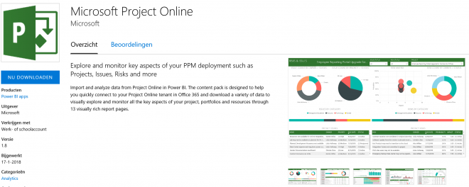
At Ignite 2017, Microsoft presented a great new content pack for the Project Online Power BI combination. And after some initial issues with the launch it’s here to stay! I’m very excited about this new version of the Power BI content pack and I would like to share four things that you might not know yet.
![]()
One: there are two ways to get the content pack
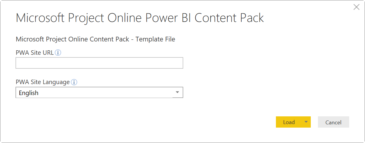
The version that is easiest to grab is included in the Power BI website. Click on “Get Data” and select the “Services”. There will be a Project Online icon there that will lead you to the download page.
The only thing you need to do now is tell the service the exact URL for your PWA and in what Language it is provisioned. Wait a minute and you are ready to go!
The other version, the one that I would advise you to use, is located at Git.Hub. It is especially useful if you want to customize the reports and dashboard, more on that later.
The Git.Hub version is basically a Power BI template file. When opening it you are prompted to provide the URL parameter and the language.
Two: the content pack uses a number of custom visuals
Custom visuals are available from the store and can be imported using the custom visual file itself. There are tons of visuals available and I would recommend you take a look at the store when creating new reports.
Interestingly, not all of the custom Power BI visuals seem to be used. Let’s take a closer look at each of the visuals.
Used in the content pack
Chicklet Slicer
This visual is almost a must have in my opinion. It extends the slicer functionality that comes default in Power BI. It adds options to create columns of values as well as use visuals such as logo’s.
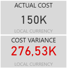
In the Content Pack for Project Online it’s used to visualize progress compared to the baseline. Here’s what it looks like in the Pack:
A nice little visual in the PORTFOLIO COSTS report that gives you insight on projects that run out of sync with their baseline values. When you select any of the values, the report changes to represent the correct list of projects.
Gantt
When the Power BI Content Pack for Project Online came out this was the go to visual to create a Gantt chart. However, times change, and I would advise you to look into a new visual called “Gantt Chart by MAQ Software“.
The visual from MAQ Software is more flexible and looks nicer in my opinion. Here’s an interesting article on what the new visual could look like in the report.
TimeLine Slicer
The TimeLine Slicer is a nice visual that is used together with the Gantt. It looks good and works very well together with any time phased data.
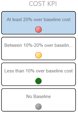
Card with Status by OKViz
Cards are very powerful visuals. A single value, boxed, to represent a important variable. But there is one big downside on the default cards: there is no visual difference between positive and negative numbers. Card with Status by OKViz does just what the name suggests, it provides a nice solution to represent the value in a specific color when a threshold is met.
Not used in the content pack
I have no clue on why the following visuals are part of the content pack. Was it oversight? Did the creator intend to include more reports? Was the content pack created by someone who had these visuals in their Power BI desktop application and did they forget to remove them before creating the pack? Mysteries we may never know the answers to…
But! They are here, and we might as well have some more insight on what they can do for us.
Long Text viewer (BETA.2)
A visual that currently is, and has been for some time already, out of BETA. So you might want to upgrade the visual to the actual “Long Text Viewer” provided by the WallingSoft Team.
This visual can be very useful if you have a lot of textual information stored in fields such as the description field.
However, as the link above states, it’s only useful in “Plain text”. Which is a shame because most big swaps of text contain “rich elements” such as bold text or bullet points.
I would like to suggest using the Custom Visual HTML Viewer. With this visual you have a similar solution as the Long Text Viewer, but including the rich text format.
WordCloud 1.4.2
It’s a shame this visual isn’t part of the Content Pack. If I look at the video that comes with the app description page at AppSource it looks like a powerful addition.
Just imagine that you had this WordCloud linked to the comments section of the KPI values. That could be a powerful visual to quickly grab the overall sentiment of the portfolio. If the words “Burning Platform” or “Escalation Needed” pop up dead center that’s a sure indication that there is some action required :-).
Text Wrapper by MAQ Software
MAQ Software is also the company that brings us the new GANTT visual. And there’s more that the company has to offer. I think it’s a sure bet to keep an eye out for MAQ Software and more wonderful things they will create in the future.
However, Text wrapping isn’t unique, and I already mentioned my personal favorite above (HTML viewer).
Image Viewer
Another WallingSoft Team visual. And I think a good addition if you work with image heavy projects. Such as construction sites, or building a new car. It could be nice to have an image on the Project One Pager. But other than that I have no real clue on what I would use this visual for in regards to the Project Online environment.
Three: the data source uses out of the box Project Online
Without changing any values in the data source you are “limited” to the standard fields within Project Online. This issue is linked to the first item on the list.
When you downloaded the template file from Git.Hub you will be able to access the data source and change it.
When you start editing the Queries, you have the option to change the values in “Removed Other Columns”, by selecting the gear to the right.
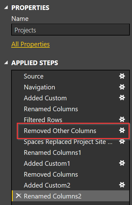
From the menu that will pop up you have the option to select fields you want to include in the data source. Now keep in mind, more data = longer loading time. Only add the fields you really need for the report and you are sure to have a faster loading time.
There’s a “Removed Other Columns” in most of the sources. But the one’s you want to focus on are Resources, Tasks and Projects. That’s where most customization happens anyway.
Four: you can change the theme
Don’t like the default Power BI colors? Don’t worry, there is a little JSON script that you can use to change the colors used in the content pack!
Let me show you how I go about changing theme colors. And I have to give credit to the original Power BI blog post on letting me know this option is in the application.
Here is the JSON script you should use if you ever want to make a valentine report:
{ "name": "Valentine's Day",
"dataColors": ["#990011", "#cc1144", "#ee7799", "#eebbcc", "#cc4477", "#cc5555", "#882222", "#A30E33"], "background":"#FFFFFF",
"foreground": "#ee7799",
"tableAccent": "#990011" }
Just put this little text in a Notepad (or other tool such as NotePad++) and save it with the extension *.json.
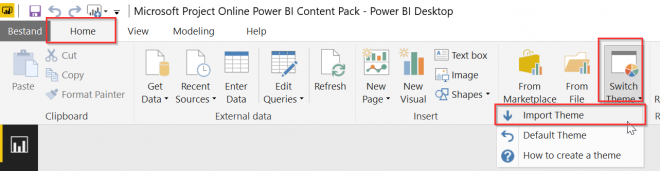
From there you can add the theme to the report by navigating to Home –> Switch Theme –> Import file.
Now, how to find those pesky HEX codes for your color? You might have a tool such as Photoshop, or you could ask your companies marketing department. But for me, I tend to take a screenshot of the color, open it in Paint, eye drop the color to grab the RBG value, and then use this website to get the HEX information.
Next question, what color represent what part in a visual? I created a little on the color schema that changes where. You can find it in the TPC OneDrive under the name “The colors in the Power BI Theme”.
Final notes
As always, I like to close with a big thank you, my lovely readers. This is another big post and you made it all the way to the end.
I love what Power BI has to offer in regards to reporting. I can still remember the struggle on getting a nice report using the OLAP Cubes and Excel ODBC files. This is much easier and much nicer solution by far.
And just remember, you have the option to do deep dives with Azure SQL and SSRS if you like to do more “hardcore reporting”. But for the most part Power BI will do the trick for your reporting needs.
If you like what I had to say about Power BI in regards to Project Online, I would like it if you let me know in the comments below.
I would also like to suggest subscribing to my newsletter. I will send you a mail every second month with information about the blog, but also about other cool things MS Project / Project Online related. Here’s the link if you are interested. And if you signed up, a double thanks is yours :-).
Hope to see you around,
Erik van Hurck
Great post especially changing the theme part!
Thanks Peter! It was a lot of fun writing the post. And who knows, maybe I’ll do a follow up post.