Hi reader,
Welcome to a first mixed effort for The Project Corner! You might already know I have a YouTube channel, in it I share how to guides and reporting magic. This article is a support article to the video I created recently. In this video I share a “easy” method to create a risk matrix report for Project Online.
Here is the embedded feed for the video:
A prerequisite for this is the Power BI content pack for Project Online. You can find more about this content pack here.
Let’s dive into the actions that are shown on the video.
Required changes to the feed
The default risk feed contains only the fields that are available in the default risk form on the SharePoint project (sub) site.
In order to create a risk matrix we need to define the locations on the grid for each risk in the lists.
In the video I shared two grids, one based on 9 cells, the other has 25. Depending on your organizations needs you can choose to use either the 9grid values or 25grid values.
We can add the values to the feed by adding the below text to the Risk feed:
 #"Added Probability9Grid" = Table.AddColumn(#"Renamed Columns", "Probability9Grid", each if [Probability] >= 0.67 then 3 else if [Probability] >= 0.33 then 2 else 1),
#"Added Impact9Grid" = Table.AddColumn(#"Added Probability9Grid", "Impact9Grid", each if [Impact] >= 7 then 3 else if [Impact] >= 4 then 2 else 1),
#"Added Probability25Grid" = Table.AddColumn(#"Added Impact9Grid", "Probability25Grid", each if [Probability] >= 0.81 then 5 else if [Probability] >= 0.61 then 4 else if [Probability] >= 0.41 then 3 else if [Probability] >= 0.21 then 2 else 1),
#"Added Impact25Grid" = Table.AddColumn(#"Added Probability25Grid", "Impact25Grid", each if [Impact] >= 9 then 5 else if [Impact] >= 7 then 4 else if [Impact] >= 5 then 3 else if [Impact] >= 3 then 2 else 1),
#"Changed Type" = Table.TransformColumnTypes(#"Added Impact25Grid",{{"Probability9Grid", type text}, {"Impact9Grid", type text}, {"Probability25Grid", type text}, {"Impact25Grid", type text}}),
#"Added 9Grid" = Table.AddColumn(#"Changed Type", "9Grid", each [Probability9Grid]&"-"&[Impact9Grid]),
#"Added 25Grid" = Table.AddColumn(#"Added 9Grid", "25Grid", each [Probability25Grid]&"-"&[Impact25Grid]),
#"Added 9GridColor" = Table.AddColumn(#"Added 25Grid", "9GridColor", each if [9Grid] = "3-2" then "Red" else if [9Grid] = "3-3" then "Red" else if [9Grid] = "2-3" then "Red" else if [9Grid] = "2-1" then "Green" else if [9Grid] = "1-1" then "Green" else if [9Grid] = "1-2" then "Green" else "Amber"),
#"Added 25GridColor" = Table.AddColumn(#"Added 9GridColor", "25GridColor", each if [25Grid] = "5-2" then "Red" else if [25Grid] = "5-3" then "Red" else if [25Grid] = "5-4" then "Red" else if [25Grid] = "5-5" then "Red" else if [25Grid] = "4-3" then "Red" else if [25Grid] = "4-4" then "Red" else if [25Grid] = "4-5" then "Red" else if [25Grid] = "3-5" then "Red" else if [25Grid] = "2-5" then "Red" else if [25Grid] = "3-1" then "Green" else if [25Grid] = "2-1" then "Green" else if [25Grid] = "2-2" then "Green" else if [25Grid] = "1-1" then "Green" else if [25Grid] = "1-2" then "Green" else if [25Grid] = "1-3" then "Green" else "Amber"),
#"Changed Type1" = Table.TransformColumnTypes(#"Added 25GridColor",{{"9GridColor", type text}, {"25GridColor", type text}}),
#"9GridOrderID" = Table.AddColumn(#"Changed Type1", "9GridOrderID", each if [9GridColor] = "Red" then 1 else if [9GridColor] = "Amber" then 2 else 3),
#"25GridOrderID" = Table.AddColumn(#"9GridOrderID", "25GridOrderID", each if [25GridColor] = "Red" then 1 else if [25GridColor] = "Amber" then 2 else 3)

in
#"25GridOrderID"
When this is done the Query settings on the right should look like this:
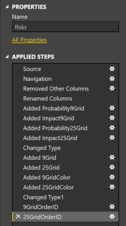
The feed now contains Grid values, severity values and order IDs.
Changes to the report
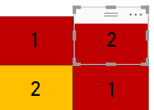
You can use the default risks pages or create a new page. You will need a matrix image. One that includes either 9 or 25 cells. The easiest way to create this matrix without using professional image tools, is PowerPoint in my opinion. Once you have these set up you will create a “card” visual for each grid cell.
Make sure the card is the same size as that grid cell and move it on top of that visual.
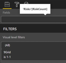
The value you are going to measure is the Riskcount. This is a new measure that you need to create by using this formula:
RiskCount = if(COUNTROWS(Risks)=BLANK(),0,COUNTROWS(Risks))
There should also be a visual filter that is equal to the grid location. For example: low probability = 1 and low impact = 1, so the grid cell value is 1-1.

When all 25 or 9 cells are properly populated you have a fully functional risk matrix :-)!
Finishing touches to our risk matrix
Now we created the grid for the risk matrix and we populated it with all its values. We should consider value-adding slicers.
One of these is the severity slicer, where you would like to only look for risks that are in a color section of the matrix.
We previously created the columns 9GridColor and 25GridColor, to show this data. So let’s use one of those and add it to a normal slicer.

You can also add it as a chicklet slicer.

In order to get the Red, Amber, Green sorted correctly you will need to use the Order ID columns previously created. If you don’t do this, the sorting will be alphabetical and will show up as Amber Green Red… not very useful :-).
The YouTube channel
In the video I share the steps to create the risk matrix. And I would highly recommend viewing it. At the top of the blog post I included a embedded link, if that doesn’t work for some reason head over to the channel and find it there.
There’s more to be found on the channel, I like to tweak with reporting in Project Online and Project Pro a lot. So if that’s something that you like to know more about head on over there and subscribe to the feed because I’m sure to bring more reporting magic to the channel regularly.
Sharing is caring
As most of the frequent readers already know, I have a newsletter. And there’s another newsletter specifically for the YouTube channel. Both newsletters contain more information on what has been published on TPC.
The YouTube channel newsletter focuses on the content provided on the YouTube channel. It also includes a separate file share that subscribers can access. This file share contains (some of) the files I use during the video’s. For instance, this video contains a Power BI report including the steps above that you can download for free.
The regular TPC newsletter focuses on this blog, but will also share other exciting news items I found on the internet. There’s also a file share that can only be accessed when subscribing to this list. For instance, this post contains pictures of a Power BI report that you can download for free (the images are also available from the YouTube newsletter and vice versa don’t worry).
Hope you liked this combo post and the video that’s included. Please let me know in the comments below if you want to see more of these in the future.
Kind regards,
Erik van Huck